Hi everyone!
Well, as you can probably tell by now...the new Carabijoux logo is making itself at home!
I really hope that you all love the new style that Carabijoux is taking on...I'd love to explain a little bit more about why I've made these exciting changes...

I usually design my own branding and logo in Photoshop. As some of you may know, I have got a background in design, and whilst I'm no graphic designer, I'm usually able to find my way around Photoshop and Illustrator enough to create a logo or banner.
I designed my previous logo just over a year ago...My jewellery designs back then were almost 'vintage' looking, and the logo did fit the 'feel' of my work quite well. It worked, and I stuck with it.
Fast forward 18 months or so, and my jewellery 'style' has evolved so much that the logo just didn't seem to fit anymore. The way my jewellery has changed is probably something I could write a whole new post about, but my pieces are now much more cutting-edge, simple and modern...and I needed a logo to fit.
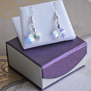
I had already decided on the colour before I looked into a new logo. In the past, I tended to use lots of pink for my branding. I am definitely a girly girl, and I adore pink. In previous years, my jewellery has often featured a lot of pink (I tended to choose it naturally for my work because it appealed so much to me), but now my designs seem to have outgrown the 'pink theme'. I got the inspiration for the new colour scheme from my new boxes. I know it sounds like putting the cart before the horse, but once I found the right packaging, I knew the branding would follow. This rich, delicious purple was just perfect...it's so grown-up, and regal...I decided that the new branding should be based around this wonderful, juicy berry colour.

I decided that it was time to call a professional for the new logo. My jewellery is now a premium line, and it needed a premium logo to complement it. After hours of trawling the internet, I eventually found MollySue Logos (please check her out:
www.etsy.com/shop/mollysuelogos) - and we were instantly on the same wave length...something I find so important when working with a designer!
I explained to Karli that I wanted the branding to be 'upmarket', but with a relaxed and informal feel, that doesn't take itself too seriously. A lot of jewellery designers who use Swarovski seem to keep the branding very formal and ornate - whilst there is nothing wrong with that, it doesn't fit what my designs are all about. I'm passionate about showing Swarovski in a fun and creative way...and I needed the logo and banner to reflect this. We agreed that the text in the logo should be bold and different - the 'handwritten' style of the one we chose reflects the fact that the jewellery is handmade, with the strap line being a little more formal and structured.

Karli asked me whether I wanted a symbol included with the design. With purple being a traditionally regal colour, one associated with royalty and wealth, we thought it might be fun to include a crown somewhere in the design. I love the idea of using a symbol in my packaging and external branding, so a crown just seemed perfect. I absolutely adore the way Karli used the crown in the 'i' and 'j' of Carabijoux...it works perfectly!
So there you have it...the new Carabijoux logo and branding! I just love it, and I would really appreciate any feedback (good or bad!) that you guys may have on it!
Sorry for a long post today!
Cerries xxxx


